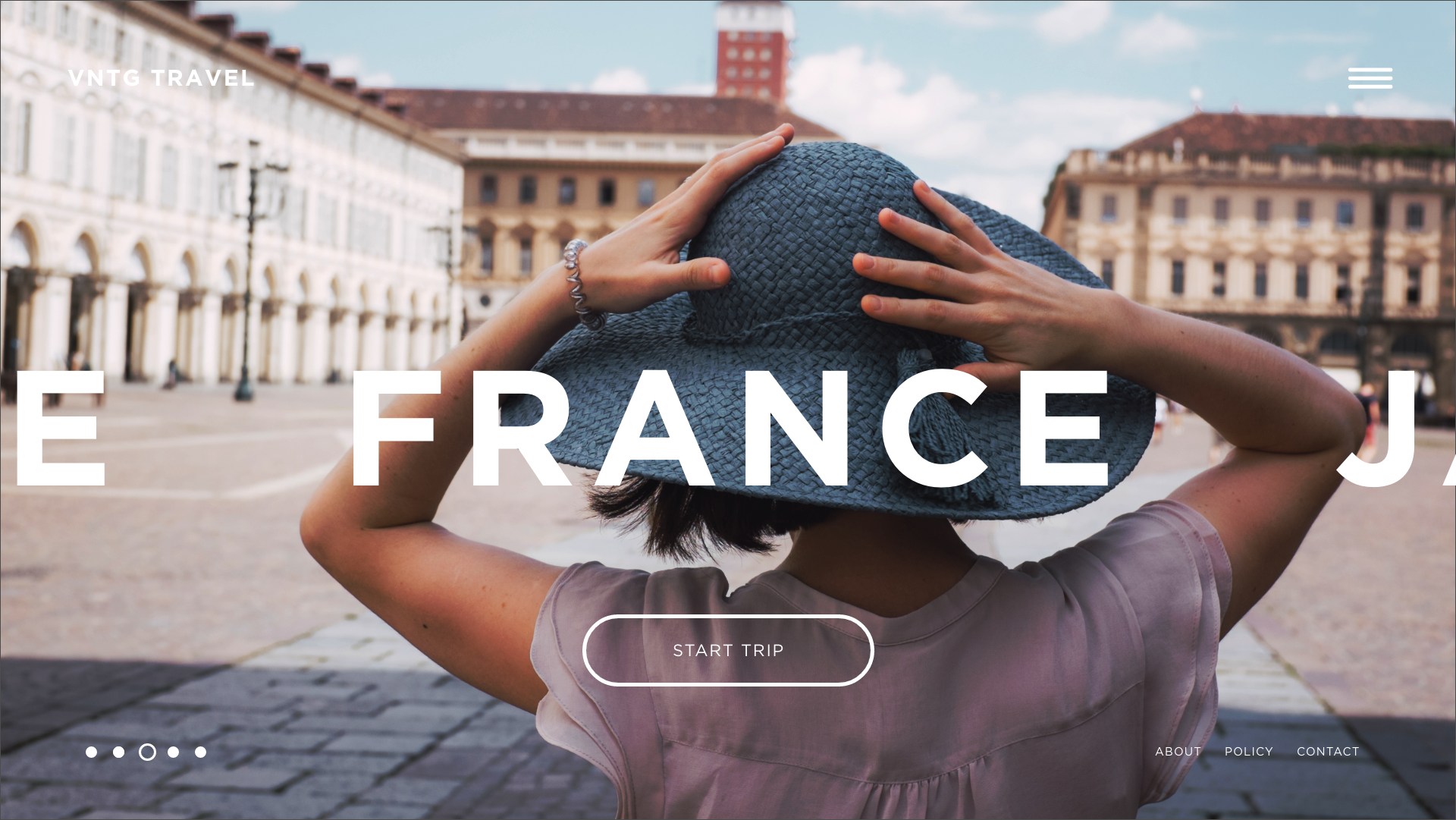
Travel Website - UX/UI
Because the journey stars at the first click.

TRAVEL WEBSITE
When looking for a place to travel, we want to envision ourselves there immediately.
Details.
Objective -To take the simple idea of freshness and organically grown and make it representative and appealing to the growing organic food culture.
Approach - Taking an outdated wheat design, and simplifying it. While also creating a clean logo that appeals to the modern generation.
Results - A branded logo that is clean and modern as well and a logo mark that is a symbol of freshness and serves also as an arrow that points them to where they need to go to get fresh food.


