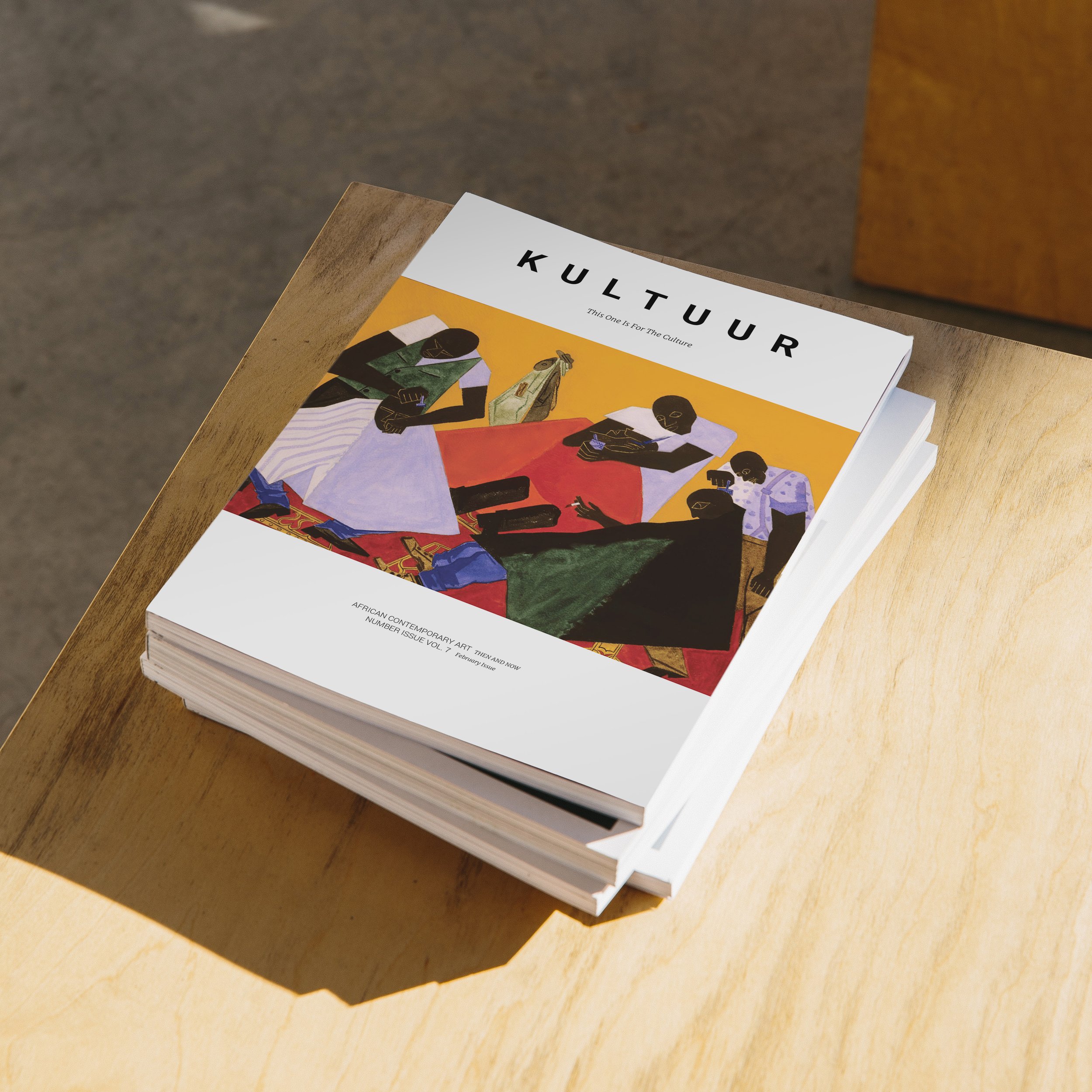
Kultuur Magazine
A Mordern Urban Culture Magazine with a fine art feel.

KULTUUR MAGAZINE
A new sophisticated look
for African Abstract Art
Details.
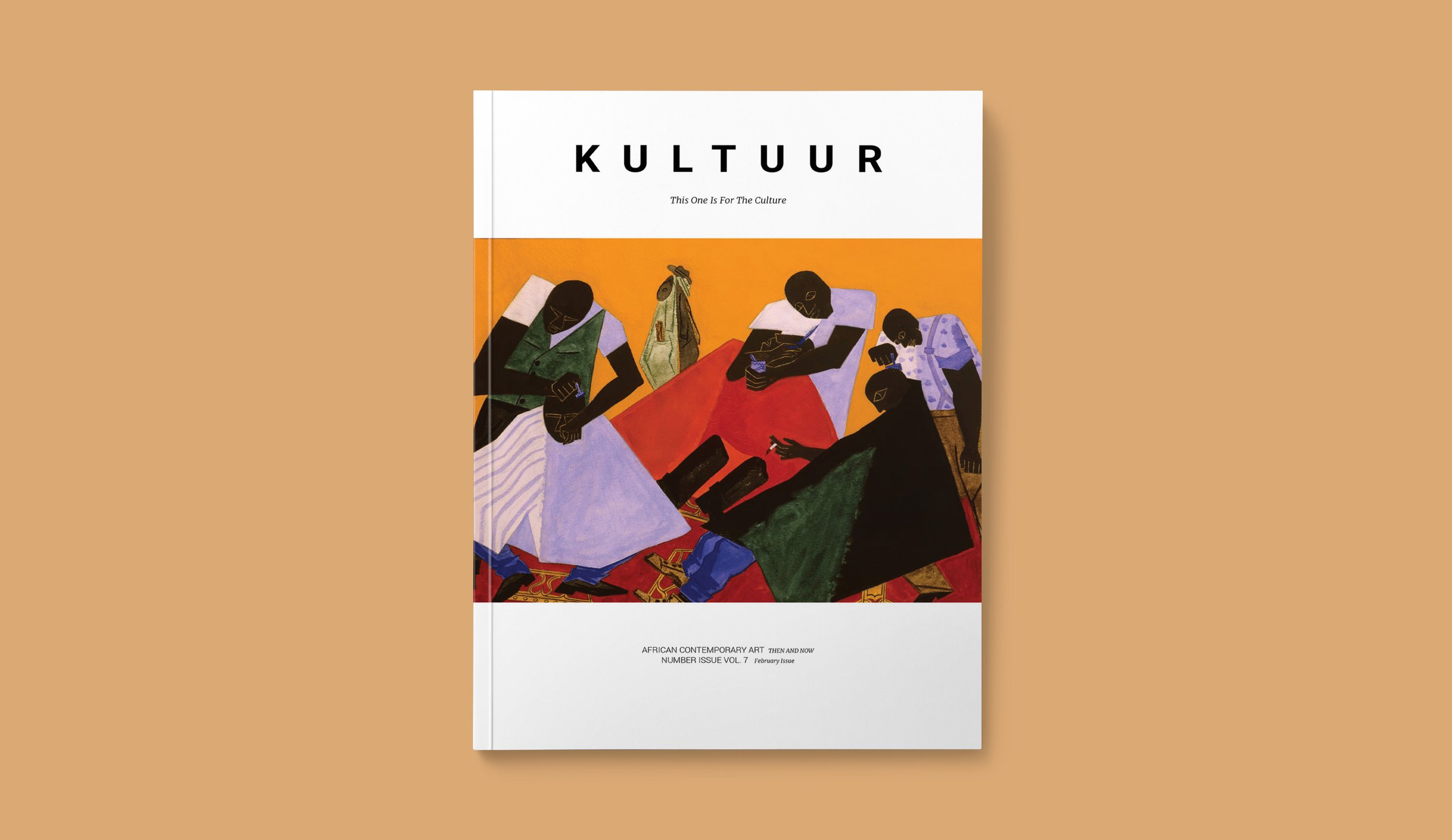
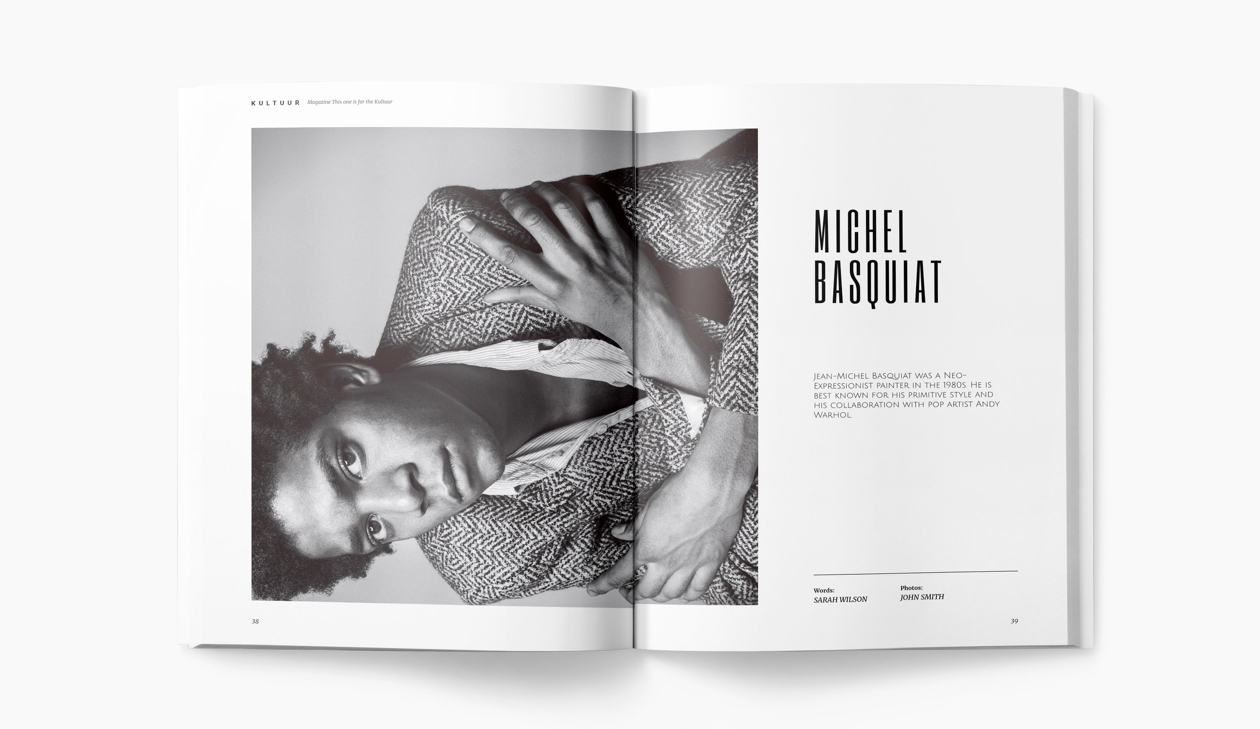
Kultuur Magazine is a sample project of my creation that emphasizes the importance of African and African American representation in the arts. It takes on a modern art gallery styling to display contemporary and modern works of art from the current and past influential artists. The layout emphasizes white space and bold imagery to drive home
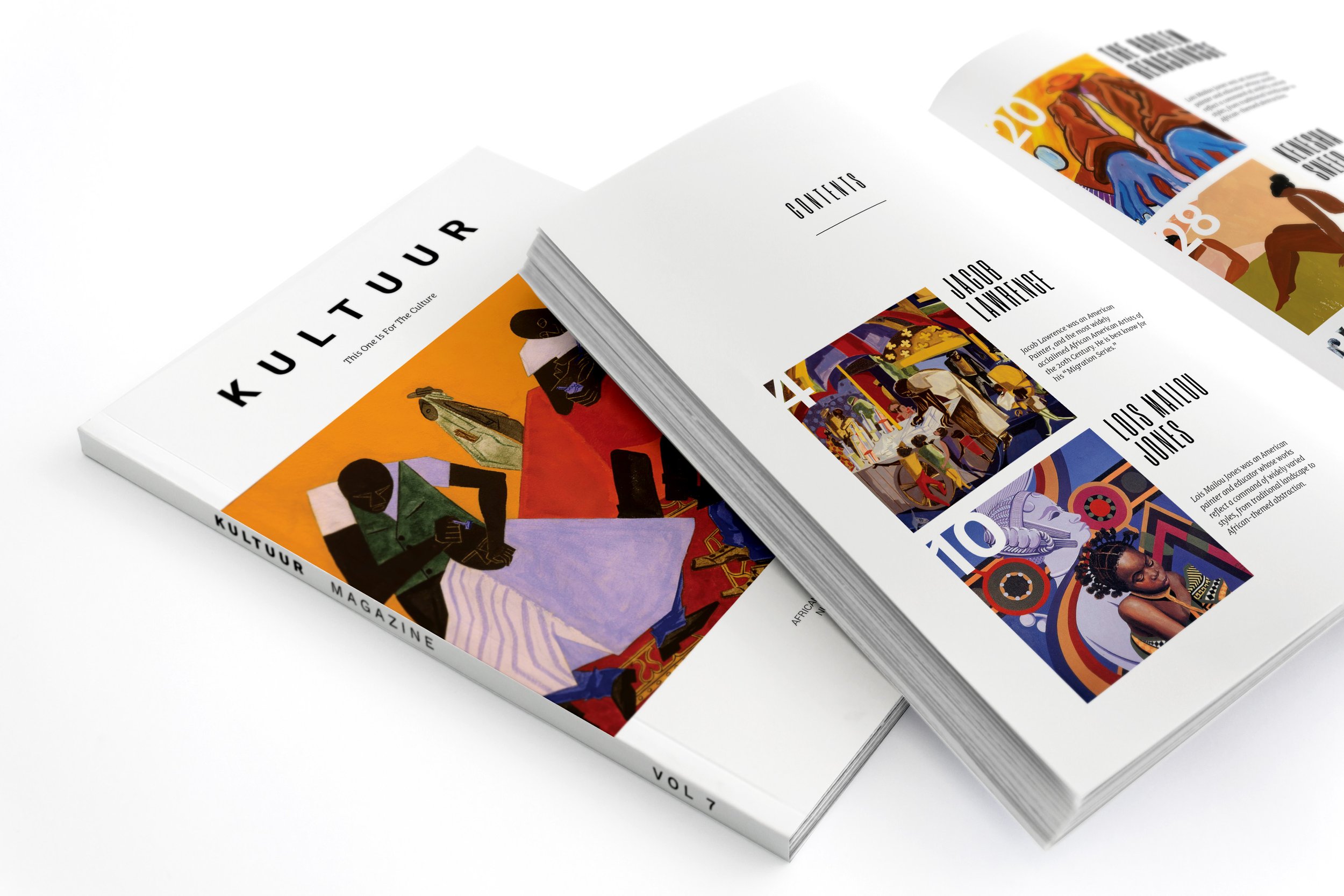
The strategy for this layout was to maintain breathability and focus on high impact imagery. So whether the reader is just browsing, looking at the images, or reading article after article there would be a balance and pace that each would be able to take time to enjoy and learn from. The layout uses a clean 2 column modular system to provide a more navigable structure, maintain easy-going readability, and leaves enough white space so that reader fatigue is reduced and the article shines right alongside the work of the artists. Each section incorporated the history, traditions, and unique story of each artist as they became influential people in the black community and to the world. The design is based around a new bold identity. The logotype appears in all uppercase, conveying a sense of strength and modernity. The spine sports the logotype in bold letters with sans serif font that is readable and noticeable across the room if the magazine were put into a stack. This set it apart from other magazines by making a bold statement that it is new and it is present.
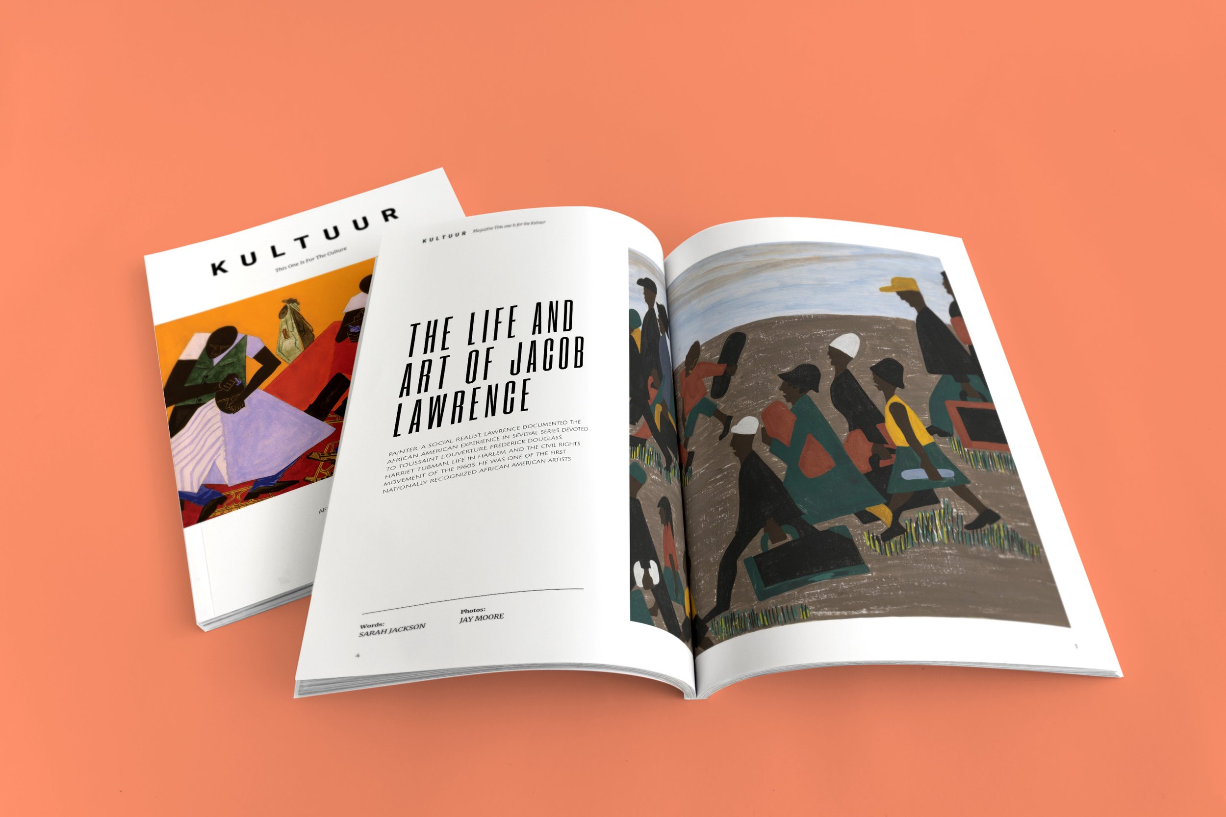
The front of the book opens with the contents pages, offering a bold, colorful, and detailed look at all of the highlighted content the magazine has to offer. This helps the reader focus on some of the most important topics and artists highlighted in the magazine. The design is more visual, with greater use of commissioned illustrations, photography, and infographics. The magazine pushes this to the forefront from the very first pages and with the publication The art and life of Jacob Lawrence. The design adds visual texture and detail - spot illustrations, pull quotes, data points - to make the publication richer and more active, and to offer more entry points for the reader. The primary display font is Work Sans, a modern reinterpretation of a historical font with a smart, futuristic quality.
