Paterson, Laurel, & Page
3 Attorneys at law who have character and class.

PATERSON, LAUREL, & PAGE
Working as professionals with style that feels personal to them.
Details.
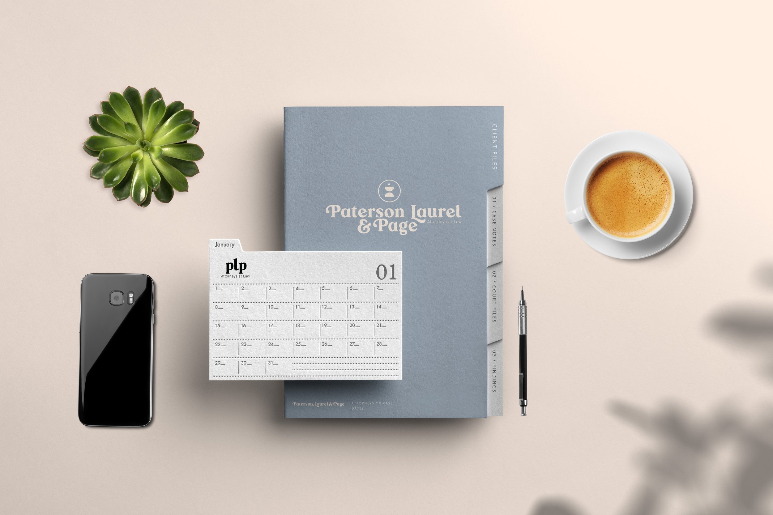
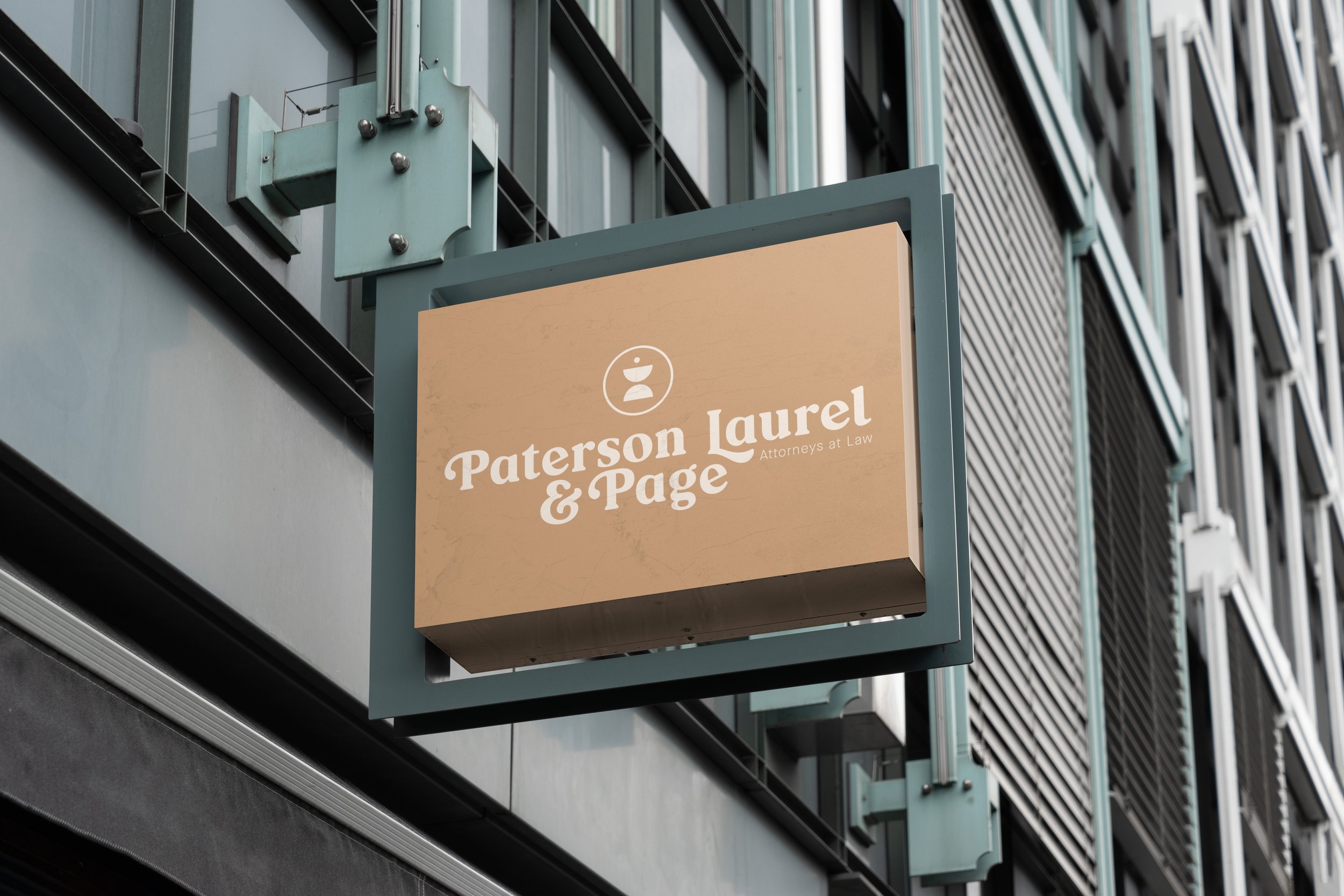
Objective - Enhance the old logo and colors and make it more feminine while remaining professional.
Approach - The approach was to find a new font that may have had some ligatures that can add distinctness to the names and make the letters in the names stand out as individuals and still look cohesive as a group. The idea was to exude balance and professionalism with color and placement. The logomark is the scale of justice and also represents balance and a person attaining knowledge.
Results - A logo and a color palette that seems feminine and professional and resembles that of coffee and a cool breeze.


